
BEFORE:

and another iteration of BEFORE! pretty, but not me.

AFTER:

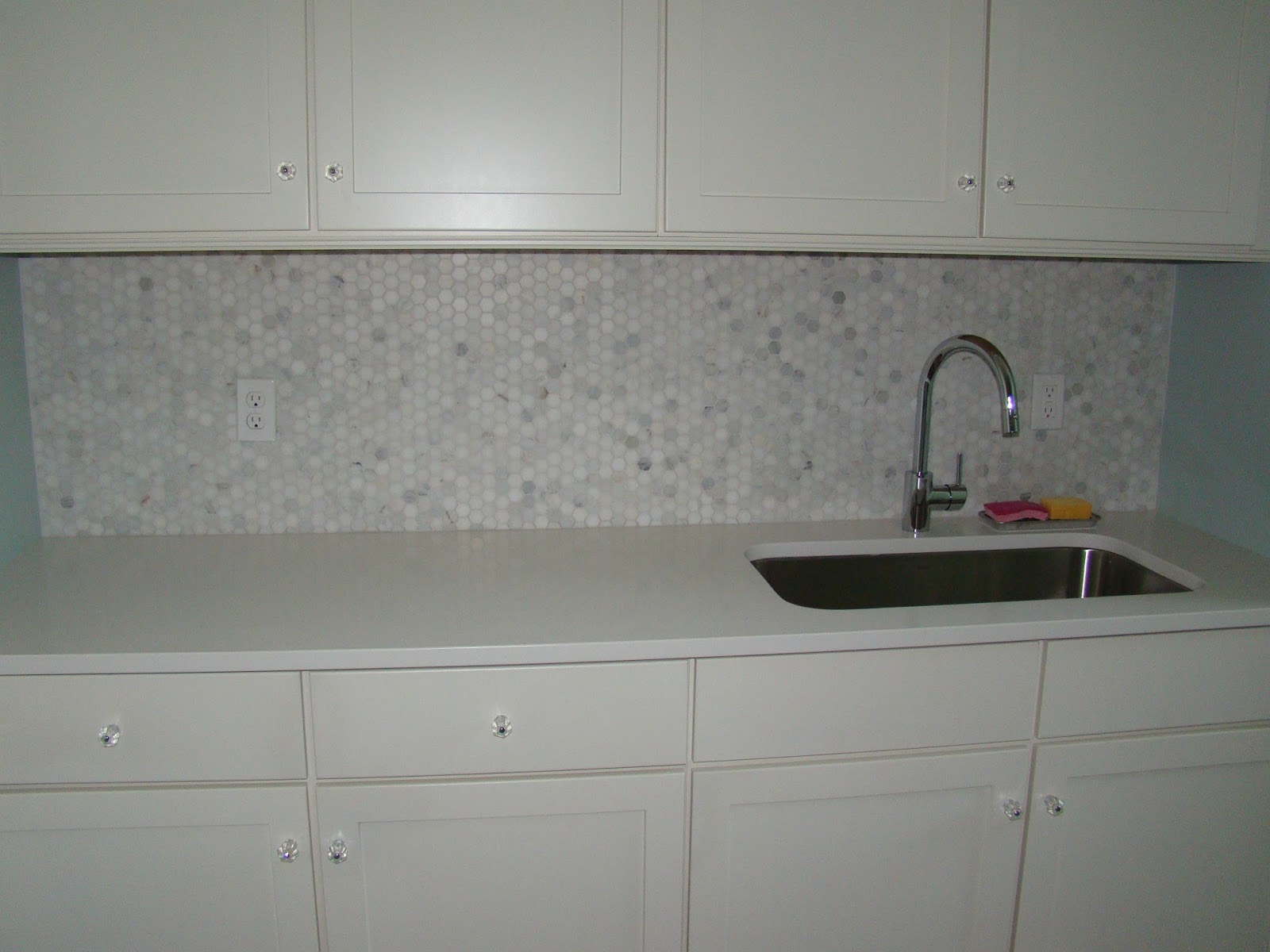
our laundry has had several iterations of "before" - it started as the most blah, boring space imaginable complete with formica countertop, a small over mount sink, and a faucet that moved from side to side when you turned the handle. the finishes weren't up to par with the rest of the house which was odd and annoying. the first thing i did was replace the counter with white quartz, add a big undermount sink, sleek faucet, and add a marble hexagon backsplash probably about 3 years ago.
BEFORE #2:
i painted the walls, even wallpapered them, but still was never quite satisfied. basically i was trying to put lipstick on a pig and not tackle the real issue which was the flooring. here's the original flooring:
BEFORE #3:

sometimes it looked blue, sometimes purple, but every time it looked UGLY! anyone who followed along on instagram likely knows that in the end i went with a honed black slate and laid it in a herringbone pattern. the tiles are 3x12 and i love how it turned out.

(yes we have an old school telephone!!!)
but if you're going to change the floors, you might as well take the opportunity to really change the whole space. 😉 in addition to flooring, my list included paint, a wall treatment, shelving, additional cabinetry and lighting.

the decision that plagued me the most by far was the paint color for the cabinets. i knew i wanted to paint them - they were that same cream color as the rest of the house and to me that color just looked dirty, especially with the white quartz counter - and i wanted to have some fun with the color so i opted not to do white. but i went around and around from beige to blue/green to dark green and then finally greige. i didn't want straight gray cabinets - that to me felt too cold and lacked depth. the color needed to feel light and warm and interesting. knowing that black slate would be on the floor, i was hyper-focused on ensuring that the rest of the space had plenty of warm elements to balance out all of that black. the winner was agreeable gray by sherwin williams and what's funny is that i originally eliminated it because i thought it was too gray but i'm so glad i took a second look - it really does read that perfect greige color.

as with our hall bathroom, everything in this space was sprayed. i wanted that no-brush-mark finish which spraying delivers.
another big design decision was to add vertical boards to the walls (like shiplap but hung vertically). i knew going in that i wanted to add some millwork for interest and found these mdf boards that were pre-milled to create about a 1/8" gap between the boards. they were called nickel gap boards but the space is definitely larger than a nickel. after adding the vertical planking, we realized that we needed to add crown moulding to finish off the ceiling - our ceiling had a small angle at the top and the crown hid that perfectly.

another big piece to the project was adding functionality. the space above the washer/dryer before didn't have any cabinetry - there was one long open shelf that i couldn't reach. i opted to add two cabinets on each end and a white oak floating shelf in between. the new shelf doesn't add much function but it adds texture and warmth plus a space to style. :) it also gives the rod something to relate to. there wasn't any light on this side of the room, so we added one that feels perfectly utilitarian to me.
the new shelves are white oak and i love how they came out. i added one to the nook under the window to add a little folding station there and have a spot to tuck our rolling hamper underneath.

i toyed with adding a cabinet to the left of the washing machine but didn't love the imbalance that would create with the right side so i left it open. it turned out that the double steele laundry cart fit perfectly in that spot!

the hardware was a bit of a labor of love. i wanted the warmth of brass but i didn't want it to feel overly modern or shiny. so i took unlacquered brass knobs and pulls and aged them myself instead of waiting for that natural patina. i'm very happy with how they turned out!

i'm still waiting on fabric for a roman shade for the window and when that comes, i'll share that final touch! but even without it, i'm SO happy with this spot now. goes to show - don't cheap out and do it right the first time!

SOURCES!
knob | pull (6") | aging solution | hand towel | planter | candle | soap dish | white canisters | laundry cart | three sorter hamper | flushmount light | black wire basket | white pots | backsplash | faucet | shelves
paint color: sherwin williams agreeable gray
floor tile: honed black slate 3x12
grout color: tec grout in mist


No comments:
Post a Comment